Recently I came up with an interesting trick for a simpler and perhaps more intuitive (especially for beginners) way to call a Python function that take enums as an arguments.
Here is a sample code:
from graphics_2d_library import draw_pixel

draw_pixel(
    x=10,
    y=10,
    color=draw_pixel.color.BLUE  # colors are always on hand
)
graphics_2d_library module implementation:
from enum import Enum


class Color(Enum):
    RED = "red"
    GREEN = "green"
    BLUE = "blue"


def draw_pixel(x, y, color=Color.RED):
    print(f"Drawing pixel at (x={x}, y={y}) with color: {color}")


draw_pixel.color = Color  # here we bind draw_pixel function and Color enum
Pay attention to the last line of code: since Python function is also an object, you can add any attributes to it.
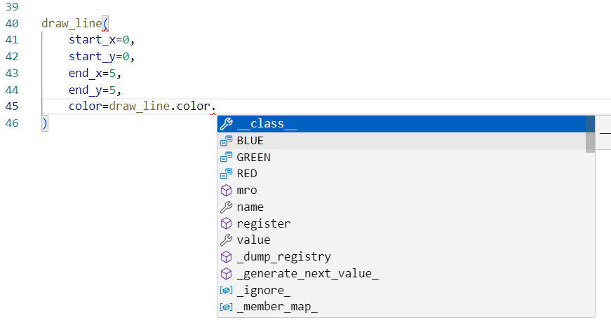
Autocomplete works too:

Owned enum
As a pioneer, I give the name of this trick - “Owned enum” (but open to your suggestions)
This can be a convention, when followed - enables better code collocation and reduce number of entities to import. Here is another example:
from graphics_2d_library import draw_pixel, draw_line

draw_pixel(
    x=10,
    y=10,
    color=draw_pixel.color.BLUE
)

draw_line(
    start_x=0,
    start_y=0,
    end_x=10,
    end_y=10,
    color=draw_line.color.BLUE,
    style=draw_line.style.DASHED,
)
Alternative?
Of course, you can use type hints, but you would still need to import enum Color.
from graphics_2d_library import draw_pixel, Color

draw_pixel(
    x=10,
    y=10,
    color=Color.BLUE
)
Alternative implementation of the graphics_2d_library module (without owned enum)
from enum import Enum


class Color(Enum):
    RED = "red"
    GREEN = "green"
    BLUE = "blue"


def draw_pixel(x, y, color: Color = Color.BLUE):
    print(f"Drawing pixel at ({x}, {y}) with color: {color}")
Inspiration and Prior work
It was inspired by the syntax of JSX namespaces, which were added to React version 0.11.0, back in 2014 (!). I think the first time that I saw them in Semantic UI React documentation, they’ve been using this approach since 2015.
The Radix UI documentation also provides a good example:
const PopoverDemo = () => (
  <Popover.Root>
    <Popover.Trigger>More info</Popover.Trigger>
    <Popover.Portal>
      <Popover.Content>
        Some more info…
        <Popover.Arrow />
      </Popover.Content>
    </Popover.Portal>
  </Popover.Root>
);